

About the client
Sanok Rubber Company S.A. (former Stomill Sanok) has a 80 year long history in the production of rubber, with applications in various sectors like automobile, construction, pharma and so on. With headquarters located in Sanok, Poland, the company over the years has established itself as one of the top European players in its market. Since 1997, the company's shares are traded on the Warsaw Stock Exchange and since 2012, Sanok Rubber has acquired two manufacturing & distribution companies in France and Germany.
For the release of the new brand, we were commissioned to create the new corporate identity of Sanok Rubber, a broad branding project which includes the design of a new visual identification, the design and development of the new website and other content collateral. Enjoy the peek behind the scenes!
Building brand equity.
Our work started with ... a road trip. We drove to Sanok, to meet the people behind the brand, and to see their facilities (which are pretty impressive!). We organised a workshop to learn more about the brand values, positioning strategy and communication goals of the company.
Without a doubt, this helped us to navigate this rebranding process into the right direction. Here is our work in a nutshell, enjoy!
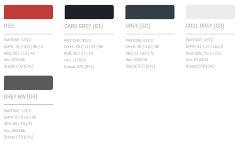
Logotype, fonts, brand colors.
The old logo of Stomil Sanok had a cartoony look and feel, which needed to change. To chose a new logo, the company organised a logo competition - which raised more than 1000 logo ideas. We helped Sanok Rubber to identify the proposal which could underline the masculine character of the brand and have a trendy, modern look. We tweaked this logo to create the new logotype for Sanok Rubber.
![]()
The new colour scheme conveys this message of masculinity and modernism:
Brandbook development.
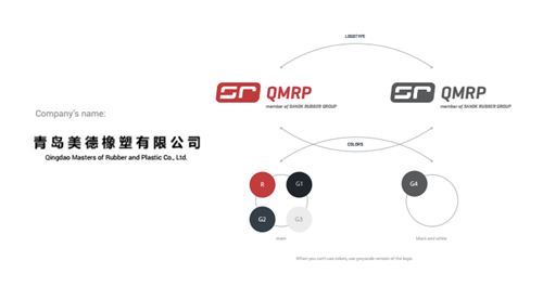
To ensure brand consistency across the companies which are part of the STOMIL SANOK S.A. Capital Group, we developed a brand book dedicated to the Chinese company Qingdao Meteor Rubber & Plastics (QMRP). The Chinese company has received branding guidelines for digital and print communications in the form of a branding booklet (brandbook).
Brand assets.
In order to generate new brand assets in line with the visual identification strategy, our client mapped out various operations, activities and events where print or digital corporate materials are needed. The brand assets pack for Sanok Rubber includes: business cards, identifications for badges, office decoration stickers, branded paper, presentation templates, roll-ups for events and other templates for e.g. job offers. Even some cool animated Season's Greetings cards ...

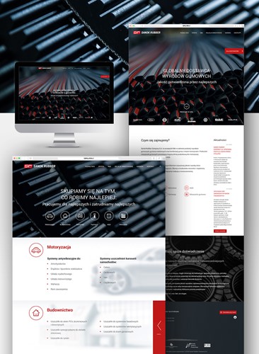
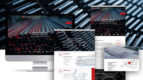
Website design and development.
The launch of the new website is the most important step in the direction of upping the brand positioning of Sanok Rubber. The website is not only a corporate communication tool which presents the history, the offer and the unique value proposition of the company, but also a business development tool, through the incorporation of a direct Call to Action to potential suppliers, to become part of the supply chain of Sanok Rubber.
We wanted the corporate website to differentiate Sanok Rubber among its competitors, so we incorporated a number of web design trends:
- in-site parallax scrolling
- Full-width hero images
- short pages (as opposed to long scroll down pages which had been trending in 2014/5)
- micro-animated sections - mostly suitable for sections built with icons
- floating sections to encourage visitors to contact sales reps
- floating widget as Call-to-Action directed at B2B
Visit the website to get the full picture!
Process. Launch. Results.
We've kept a really tight communication with our client throughout the ideation, prototyping and development phases of the project - which we say "thanks!" for!
On the day of the new website launch, we couldn't be more excited to see all these elements fall into place and collectively building a new brand identity!
